
Print ads.
Agencies call it the key visual: the one picture a whole campaign runs on. It becomes the print ad, the billboard, the poster and the banner. It makes the idea clear in two seconds, and it can run again and again.
Use it once the idea is chosen and has to work on a wall.
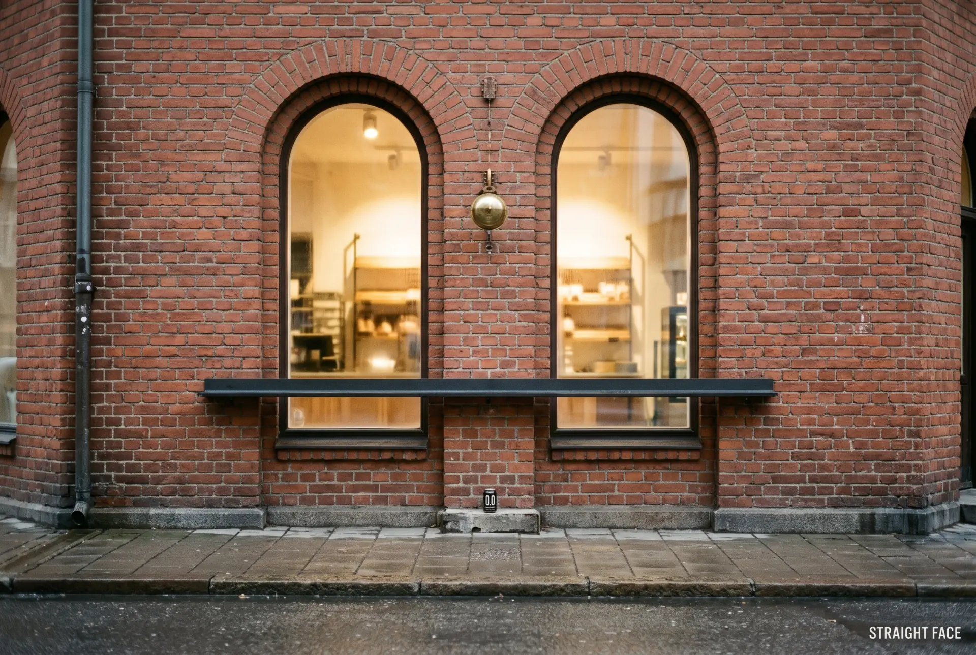
One beer, nine pictures.
Comps for Straight Face, a sample 0.0% lager, drawn by Nutcracker from one brief. A comp is the picture you agree on before anything is shot.
Four ways of looking.
Start from one true detail. When it won’t give up its picture, try these. They help, but a picture that fits none is no worse.
Consequence
Show where it leads: on the product, the person, the logo, the poster itself, or the world without the product. Exaggerate from something true.
Swap
Put your product where people expect something else, or fuse the two, through something they truly share, not just a shape.
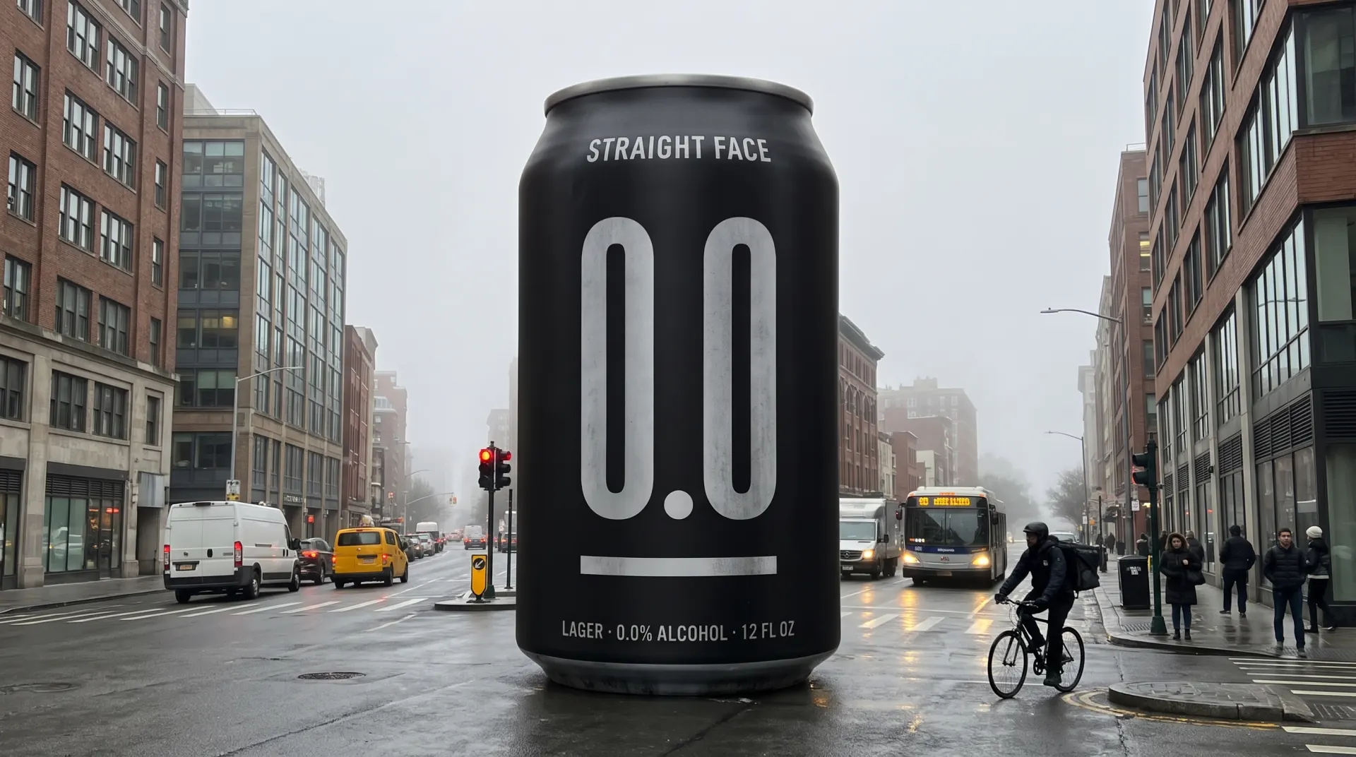
- Too big to ignore
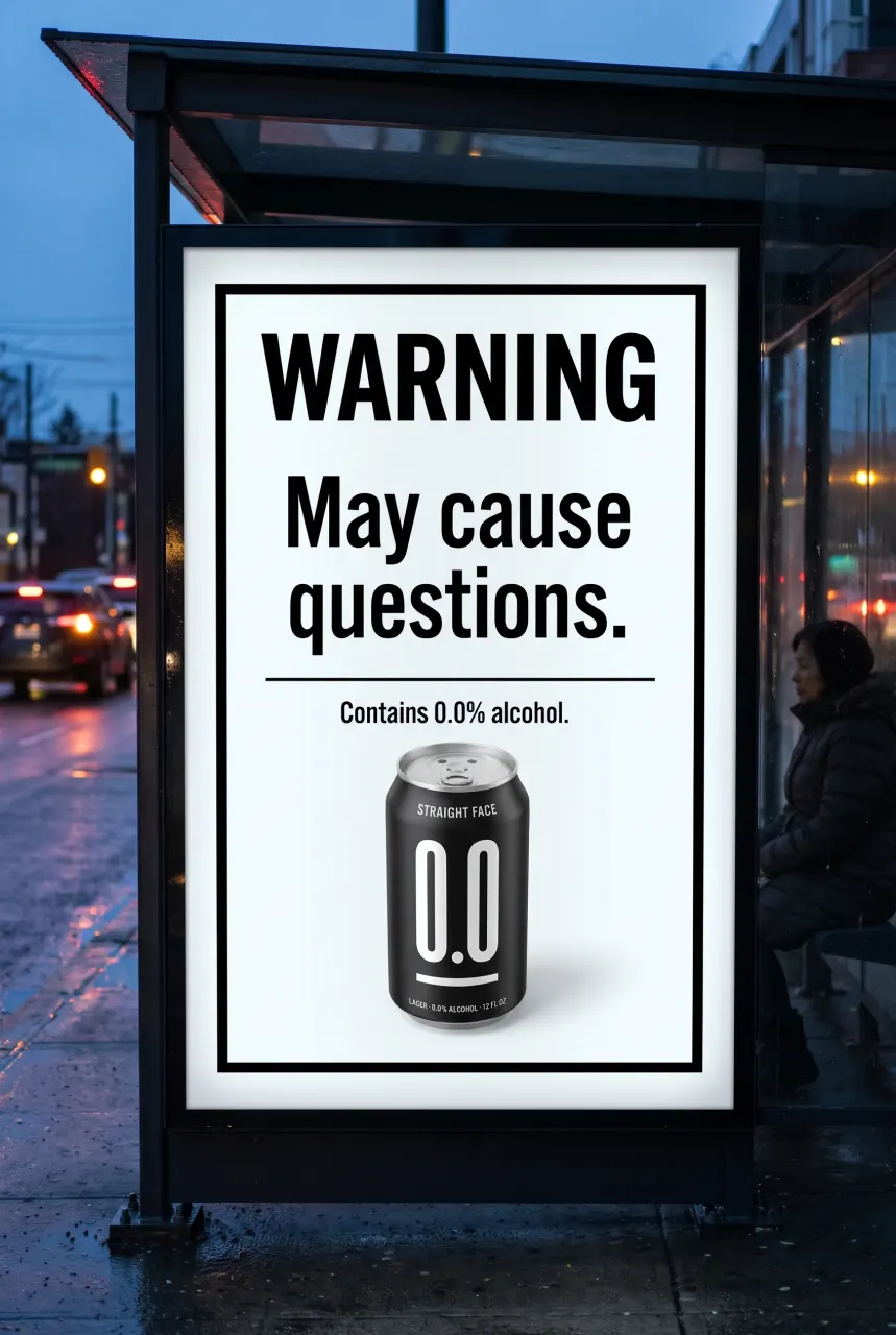
- May cause questions
Subtraction
Take away the expected hero: the logo, the copy, the price, the product, the people. What’s missing, or what stands in for it, makes the point.
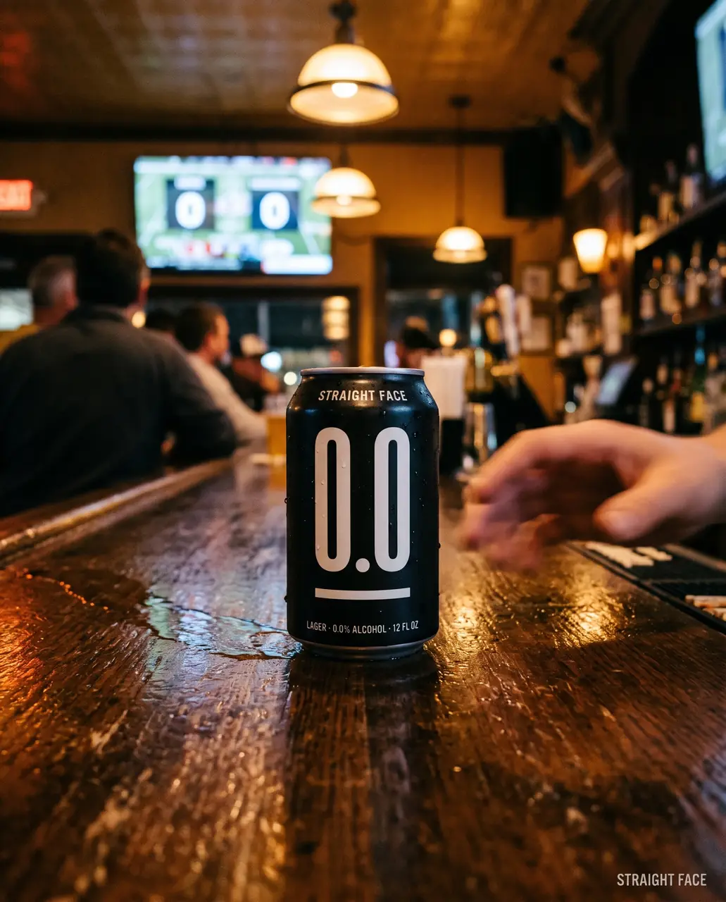
- On the board
Site
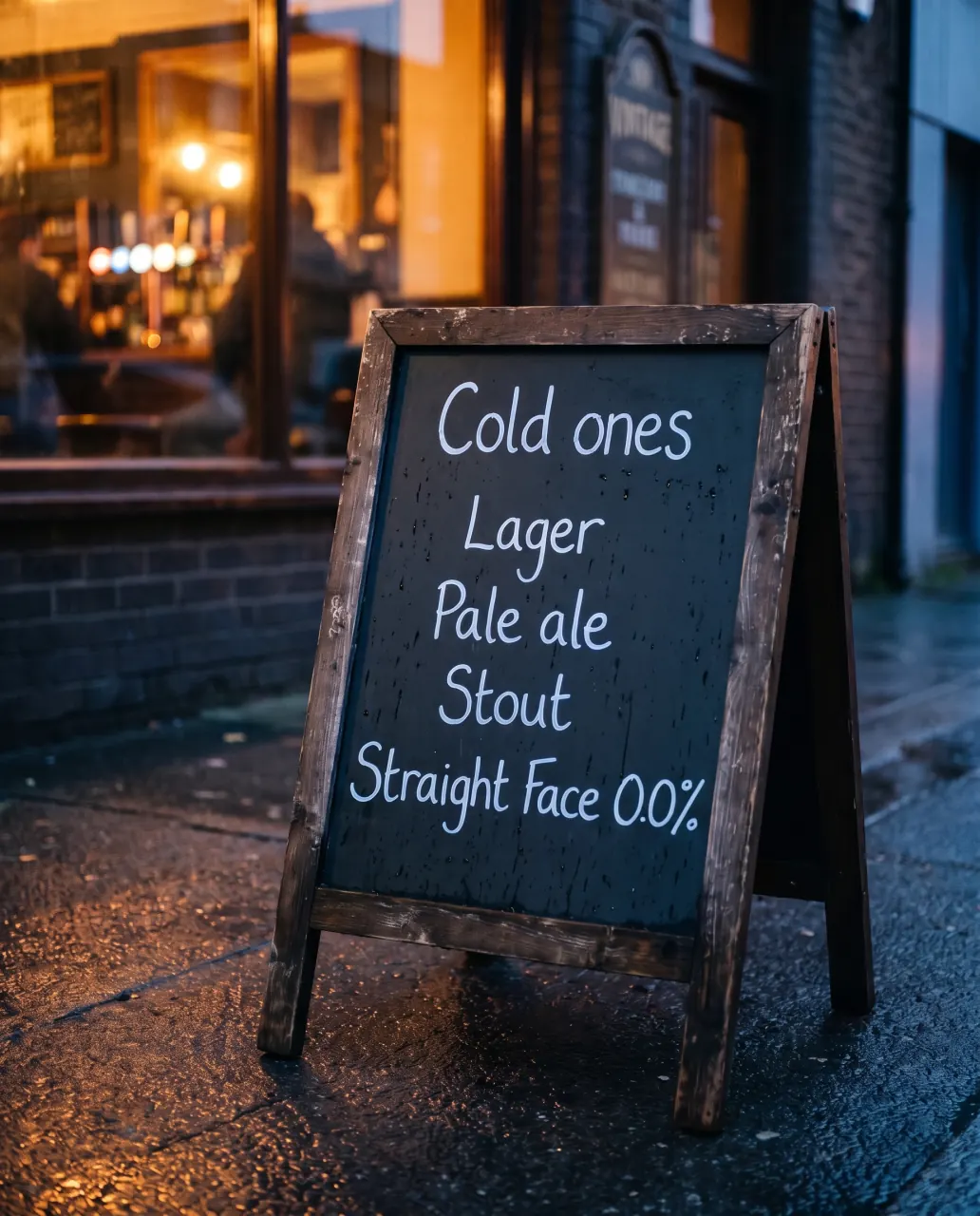
Let the place make the point: where the poster hangs, or what it’s printed on.
- Still up
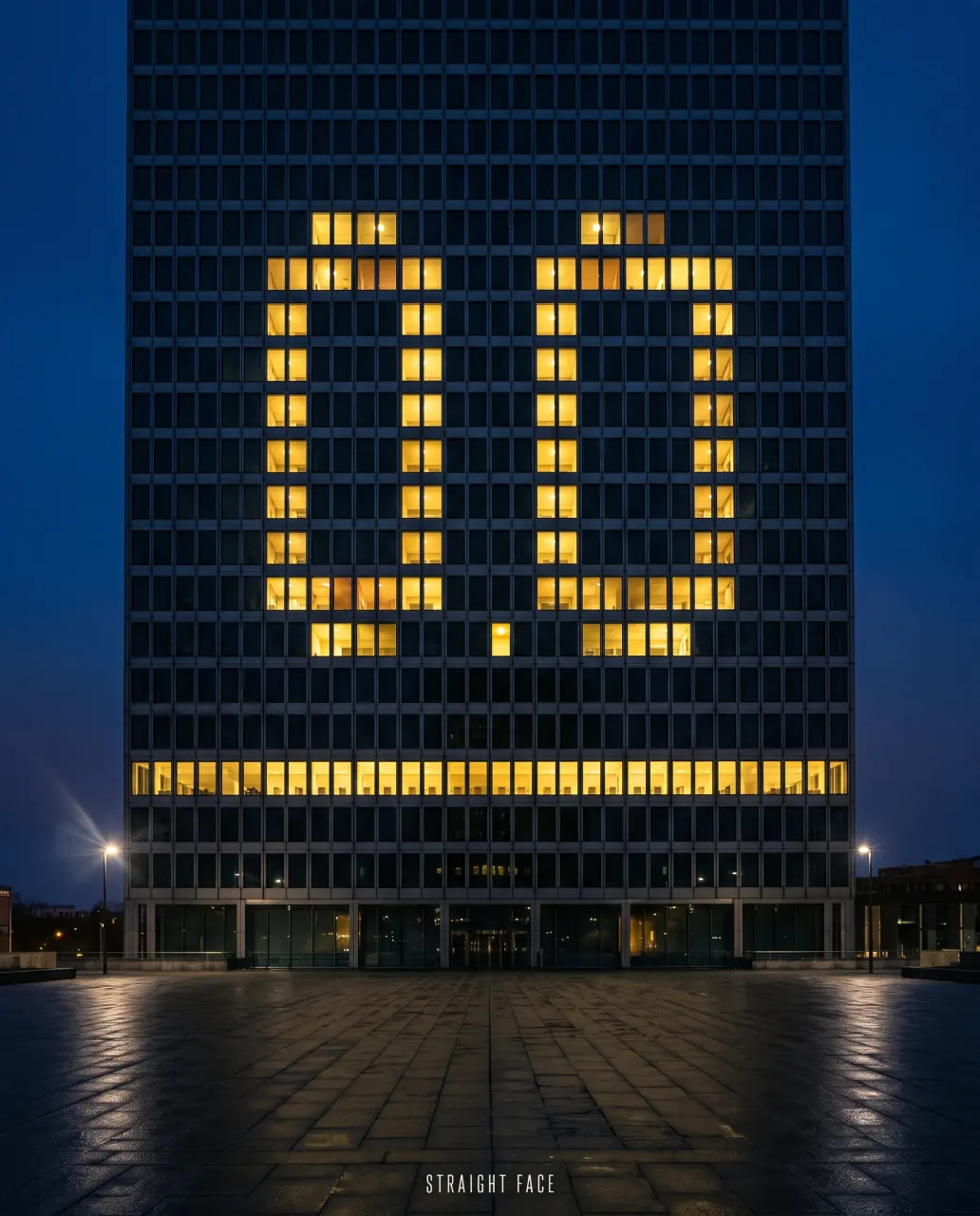
- Nil–nil
Two seconds.
Show it for two seconds, then hide it. If the point went with it, start again.
Three more before you show anyone
Cover the logo
Hide the logo. If nobody can tell whose it is, put the brand’s codes in the picture.
Say it once
The line never says what the picture shows. A headline that describes the picture wastes the wall.
Run it twice
Name what stays and what changes, then make the second one. If it can’t run twice, it’s a poster, not a campaign.
Cross these out.
The alibi bank
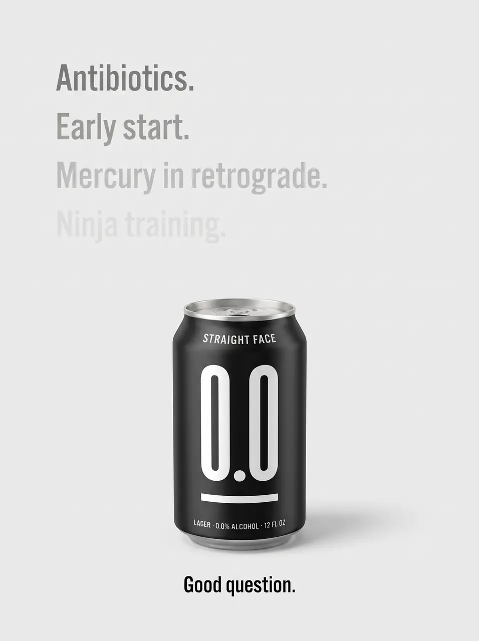
A golden pour, condensation, a glass on a sunny table.A fading list of excuses above one can on plain grey. The page says what the audience is used to explaining, then shows a beer that doesn’t need to.
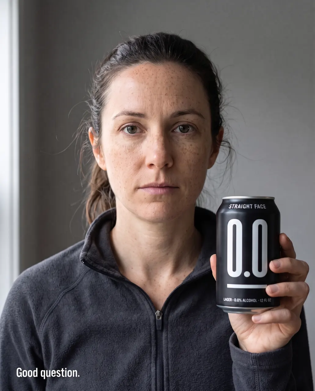
Straight faces
Friends laughing, mouths open, fun as the promise.One unsmiling person holding a can with a matching flat face. A flat face is the brand’s code, so the picture works at a glance and can run with any of your audience.
Nil–nil
A packed stadium or a crowd cheering, sport as spectacle.A can on a wet bar, a 0–0 score blurred behind it. The zero belongs to the game, so the can looks like it belongs in the room.
Too big to ignore
A hero can, lit and glossy, floating on a studio backdrop.A can the height of a building in a grey crossroads, ignored. It shows scale without a crowd or a gag, and the indifference makes it funny without a joke.
Same cheers
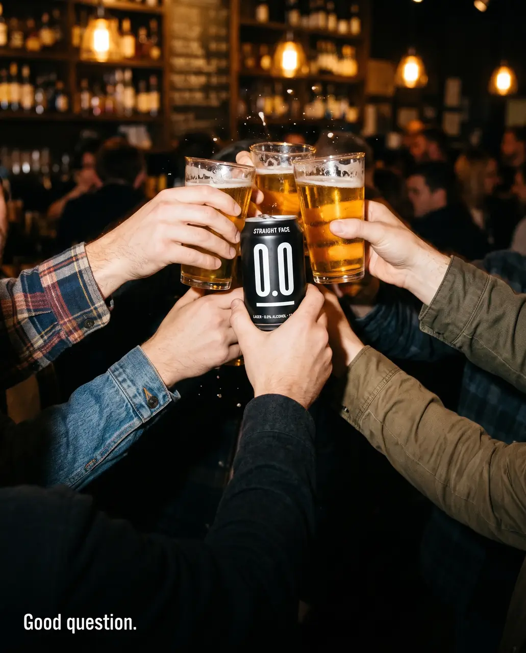
The pint as the hero, with the alcohol-free option shown apart, or hidden.The can in the middle of a pint toast, tight on hands, no faces. It shows the can held with pride, not hidden or poured into a glass, and it shames no one who drinks.
May cause questions
A “drink responsibly” line in small print at the foot of a happy scene.A full warning label with one deadpan line, “May cause questions.”, and the can under it. The category’s most boring convention becomes the headline, and the line sets up “Good question.” without shaming anyone.
Run it on your brand.
Give Nutcracker the idea and the brand. It finds the picture, writes the line and draws a comp of each for your art director. 7 days free.
Already in? Sign in